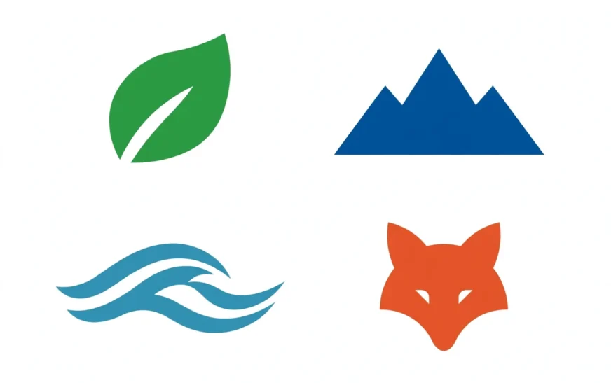
Quick answer: A good AI prompt for logo design asks for one simple mark, in one or two flat colors, on a plain background, with a named style — for example: “Minimalist logo of a fox head, flat vector style, single orange color, plain white background, clean lines, no text”. The three rules that matter most are: one idea, not three; flat and simple, not detailed and shaded; and no text in the image, because AI models still garble lettering. Add the brand name afterwards in a design tool.
Why logos are a special case
A logo is not a picture. It is a mark that must work at sixteen pixels as a favicon, on a business card, on a shop sign, and in a single color on a receipt. That brutal range of uses is why logo design has its own rules, and why a prompt that works for an illustration usually fails for a logo. An illustration can be detailed, shaded, and complex. A logo cannot. Detail that looks rich at full size becomes mud at small size, shading that looks premium in color becomes a blob in one color, and a clever idea that needs explanation is not a logo at all.
AI image tools are, by default, illustration machines. Left to themselves, they add detail, shading, texture, and background, because that is what makes most images look good. A logo prompt must fight those defaults explicitly: flat, simple, minimal, vector, plain background, no shading, no text. Every one of those words is a guardrail, and leaving one out lets the default creep back in.
The other special problem is text. AI image models still struggle with lettering, especially in logos where the text must be exact. A logo with a misspelled brand name is useless, and a logo where the letters melt into shapes is worse than no logo. The honest solution is to generate the mark without text, and add the name in a design tool where you control the font. This guide treats that as standard practice, not a workaround, because it is how professionals use AI logos without shipping broken lettering.
The anatomy of a logo prompt
A reliable logo prompt has six parts:
- Mark type. What kind of logo: an icon, a monogram, an animal head, a geometric shape, a letterform. Name it plainly: “a fox head”, “a mountain peak”, “the letter M formed from two peaks”.
- One idea. The single concept the mark expresses. A fox for cleverness, a mountain for stability, a wave for flow. One idea, not a fox on a mountain beside a wave under a sun. A logo with three ideas is three logos fighting.
- Style. Minimalist, flat vector, line art, geometric, vintage badge, modern wordmark-style icon. Pick one style. “Minimalist flat vector” is the safest default for a modern logo.
- Color. One or two flat colors, named: single orange, navy and gold, black on white. Flat colors render reliably and reproduce in print. Gradients and rainbows do not.
- Background. Plain white, or plain solid color, named explicitly. A plain background is essential, because a logo on a busy background cannot be cut out cleanly.
- Exclusions. No text, no shading, no gradient, no background detail, no photorealism. Exclusions are guardrails, and for logos they matter more than for any other image type.
Put together: “Minimalist logo of a fox head, flat vector style, single burnt orange color, plain white background, clean geometric lines, no text, no shading”. That prompt is short, but every word earns its place, and the result has a chance of being usable.
Simplicity: the rule behind all the rules
If there is one principle in logo design, it is simplicity. A logo must be describable in one sentence by someone who saw it for three seconds. “A fox head in orange.” “A mountain made of two triangles.” “A wave in a circle.” If your logo needs a paragraph to explain, it is too complex, and it will fail at small sizes no matter how good it looks large.
Simplicity is also a practical test you can run on any generated logo. Shrink it to favicon size, about sixteen pixels, and ask whether it is still recognisable. Shrink it to a business card, and ask whether the shapes still read. Convert it to one color, black on white, and ask whether it still works. A logo that passes all three tests is a logo. A logo that fails any of them is an illustration wearing a logo’s clothes.
AI prompts push toward complexity by default, so you must push back. Ask for “simple”, “minimal”, “clean lines”, and “flat” in the prompt, and then judge the result by the simplicity tests, not by how impressive it looks full-screen. An impressive, detailed mark that fails at favicon size is a failed logo, however beautiful it is.
Negative space is the designer’s version of simplicity. A mark that uses the empty space around and inside it — a fox head where the negative space forms a second shape, a letter hidden in a mountain — feels clever without adding detail. You can prompt for negative space directly: “clever use of negative space” is a phrase models understand, and it often produces marks that look more designed than a straightforward icon. Use it sparingly, for one mark, not as a default, because forced cleverness can also produce confusion.
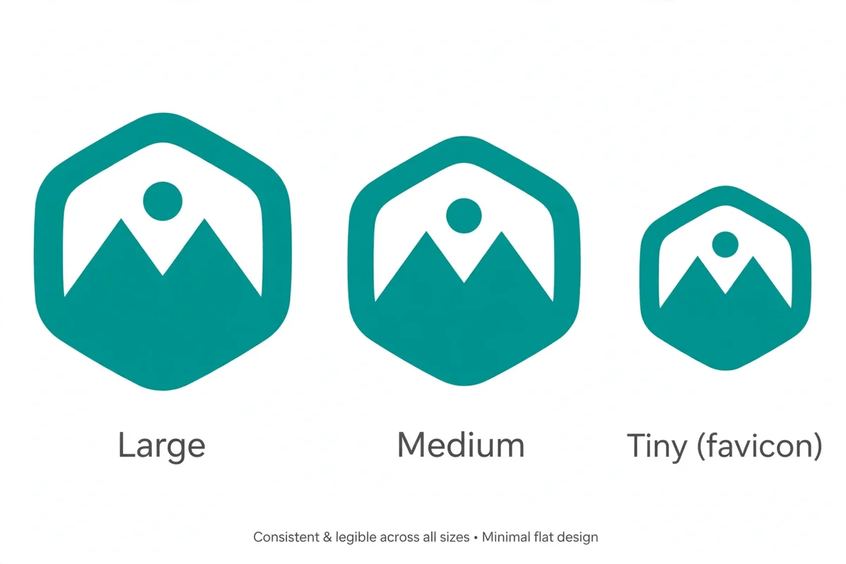
Style choices that work for logos
Minimalist flat vector is the safest modern style. Flat colors, clean edges, no shading, no texture. It reproduces everywhere, from screens to print to embroidery, and it ages well. Most startup and tech logos live here, for good reason.
Geometric builds the mark from simple shapes: circles, triangles, lines. A mountain from two triangles, a sun from a circle and rays, a bird from three arcs. Geometric marks are easy to remember and easy to reproduce, and they suit brands that want to feel structured and modern.
Line art uses a single line weight throughout, with no fill. It feels elegant and light, and it suits premium, creative, and boutique brands. The risk is that thin lines vanish at small sizes, so line-art logos need a bolder weight than you might expect.
Vintage badge puts the mark inside a circle or shield, with a retro feel. It suits food, craft, outdoor, and heritage brands. The risk is clutter: badges invite extra text, stars, and flourishes, and every extra element hurts small-size readability. Keep a badge to one mark, one ring, and no text in the image.
Abstract mark uses a shape with no literal meaning: a swoosh, a spiral, a split circle. Abstract marks suit large brands that can afford to teach the audience what the mark means, because the mark itself does not explain it. For a small brand, a mark with a hint of meaning — an animal, a mountain, a wave — is usually a better bet, because it gives the audience something to hold onto.
Pick one style per logo, and do not mix them. “Minimalist flat vector vintage badge line art” is not a style, it is a list of styles fighting, and the result will be none of them.
Color: one or two, flat, named
Color in a logo prompt should be simple, flat, and named. “Single burnt orange” is a color instruction a model can follow. “Beautiful colors” is not. “Navy and gold” is two colors with a clear relationship. “Rainbow gradient” is a reproduction nightmare.
Limit the palette to one or two colors for the mark itself. A single-color mark works everywhere, including one-color printing, embroidery, and fax-era forms that still exist in some industries. A two-color mark adds contrast and personality, but every extra color adds cost and complexity in print, and it makes the small-size test harder.
Name colors plainly, and avoid exotic color words the model may interpret unpredictably. Navy, forest green, burnt orange, charcoal, cream, gold, and teal are safe. “Sunset ombre” and “iridescent holographic” are not logo colors, they are effects, and they will not reproduce as a logo.
Also prompt for the background color separately from the mark color. “Plain white background” is the default, and it matters because a logo generated on a textured or gradient background cannot be cleanly extracted. If you want a dark version, generate a separate version with “plain black background” and light mark colors, rather than trying to invert a light version afterwards.
The typography trap
Text in AI-generated logos is the single biggest trap in this whole guide, so it deserves its own section. Image models generate text by predicting what letters look like, not by typesetting, and the result is often close but wrong: a missing letter, a swapped letter, a letter that melts into a shape. At logo sizes, that wrongness is glaring, and at favicon sizes it is fatal.
The rule is simple: do not ask the image model for text in a logo. Generate the mark alone, with “no text” in the prompt, and add the brand name in a design tool — a free tool like Canva, or a professional tool like Illustrator or Figma — where you control the font, spacing, and size exactly. That two-step workflow is how AI logos become usable logos, and it takes minutes once you have a clean mark.
If you must have text in the generated image, keep it to one or two short words, put the exact words in quotes in the prompt, and expect to regenerate several times. Even then, check every letter at full size before you use it. A logo with a misspelled brand name is worse than no logo, because it ships the error to every customer who sees it.
The same caution applies to monograms. A letterform mark — a single letter designed as a logo — is a legitimate logo type, but it still needs the letter to be exactly right. Generate monograms with the letter named plainly, check the letterform carefully, and be ready to redraw it in a vector tool if the model warps it. A monogram that is almost the right letter is not a monogram, it is a mistake.
For building logo prompts without wrestling with text, the CripsyWire AI image prompt builder gives you a clean starting structure. Use it for the mark, then add your name in a design tool.
Copy-ready logo prompts
Tech startup, fox: “Minimalist logo of a fox head, flat vector style, single burnt orange color, plain white background, clean geometric lines, no text, no shading”
Coffee brand, mountain: “Minimalist logo of a mountain peak with a coffee bean shape in negative space, flat vector style, single forest green color, plain white background, no text”
Fitness brand, wave: “Minimalist logo of a dynamic wave in a circle, flat vector style, navy blue color, plain white background, clean lines, no text, no gradient”
Bakery, wheat: “Vintage badge logo of a wheat stalk, flat vector style, single warm brown color, plain white background, simple badge ring, no text”
Consultancy, abstract: “Minimalist abstract logo of two overlapping triangles forming an upward arrow, flat vector style, charcoal and gold colors, plain white background, no text”
Pet brand, paw: “Minimalist logo of a paw print formed from four circles and a pad shape, flat vector style, single teal color, plain white background, no text, no shading”
Each prompt follows the same anatomy: mark, idea, style, color, background, exclusions. Change one element at a time for your own brand, and keep the structure fixed.
Testing a logo before you use it
A generated logo is a draft, not a finished brand mark, until it passes four tests.
The favicon test. Shrink it to sixteen pixels. Is it still recognisable? If it becomes a blob, simplify the mark: fewer shapes, bolder lines, more contrast.
The one-color test. Convert it to black on white. Does it still work? If it depends on color to be readable, it will fail in one-color printing and embroidery.
The distance test. Look at it from across the room, or on a phone screen at arm’s length. Does the idea read instantly? If you have to explain it, simplify it.
The competitor test. Put it next to three logos in your industry. Does it look distinct, or does it blend in? A logo that looks like every other logo in the field is not doing its job, however clean it is.
If a logo fails a test, do not just regenerate and hope. Diagnose the failure: too many shapes, too thin lines, too little contrast, too much detail. Fix that one thing in the prompt, and regenerate. The same one-change-at-a-time discipline that works for other prompts works here, and it is faster than random regeneration.
Also check the logo in context, not just on white. Put it on a mock business card, a website header, and a social avatar. A mark that looks great alone can look lost on a busy header, or too bold on a quiet card. Context is where logos live, so judge them there.
From AI draft to real brand mark
An AI logo is best treated as a concept draft, not a final brand asset. The professional workflow is: generate several concepts with AI, pick the strongest idea, then redraw or refine it in a vector tool. Vector redrawing gives you clean edges, exact colors, scalable files, and a mark you can actually hand to a printer. It also gives you ownership in a practical sense: a redrawn mark is yours in a way a raw generated image, with its uncertain provenance, may not be.
This matters for trademark too. A logo generated from a prompt may resemble an existing mark, especially if the prompt named a common animal or shape in a common style. Before you invest in a logo — printing, signage, packaging — check that it does not clash with existing marks in your industry, and consider a trademark search for a serious brand. AI generation does not check for you, and “the model made it” is not a defence against a clash.
For a hobby project, a side project, or a placeholder, a raw AI mark is fine. For a business you plan to grow, treat the AI output as the sketch, and invest in the vector version. The sketch saves you the blank-page problem, which is real, and the vector version gives you the asset, which is what a brand actually needs.
The same honest framing runs through other CripsyWire guides. The best free AI video generators guide is careful about what AI tools replace and what they only assist with, and logo design is firmly in the assist category for serious brands.
Logo prompts for everyday brands
Logo prompts are not only for tech startups. They work for everyday brands too, and the same anatomy — mark, idea, style, color, background, exclusions — applies to all of them.
A workspace or desk brand, for example, might use a simple monitor or desk mark in one color. The guide to a two-screen desk setup shows how a desk arrangement can be reduced to a few shapes, and a logo prompt for the same idea should do the same reduction: two rectangles for screens, one line for a desk, nothing else.
A smartwatch or wearable brand might use a watch face or a heartbeat line as its mark. The review of the latest Samsung smartwatch shows the product’s circular face and rotating bezel, and a logo prompt that borrows one of those shapes — a circle, a bezel ring — will feel related to the product without copying it.
A phone accessory brand might use a simple phone outline or a charging bolt. The troubleshooting guide for a faulty phone microphone is a reminder that phone imagery is familiar to everyone, so a phone-based mark must be simple enough to stand out from every other phone outline.
A connectivity brand might use a signal wave or a node pattern. The explainer on the next wireless standard gives the technical context, and a logo prompt for a connectivity brand should pick one wave idea — arcs, dots, a node — rather than trying to draw a whole network.
A charging brand might use a bolt in a circle, or a pad shape. The roundup of the best wireless chargers shows how many charger forms exist, and a logo that picks one form, in one color, will read faster than one that tries to show them all.
A laptop or education brand might use an open laptop shape or a book shape. The guide to switching off a Chromebook touchscreen names the device precisely, and a logo prompt for an education brand should name its mark just as precisely: an open laptop, a book, a graduation cap — one of them, not all three.
A productivity brand might use a checkmark, a list, or a clock. The collection of productivity browser extensions shows how productivity is really about small, repeatable actions, and a logo mark that shows one action — a tick, a list — captures that better than a complex scene.
A hardware brand might use a circuit shape or a single component outline. The guide on identifying your PC hardware names the parts builders recognise, and a hardware logo that borrows one part shape — a chip, a board edge — will feel credible to that audience.
An examples collection is a good place to test logo ideas against other image types. The collection of AI image prompt examples shows how a style word changes an image, and the same test applies to logos: change the style word, and the mark changes, even when the idea stays the same.
Finally, a photo brand might use a camera outline, a frame, or a mountain-and-sun mark. The guide to how many photos fit on 128GB shows how photo topics are really about memories and storage, and a photo-brand logo should pick one of those ideas — a frame for memories, a stack for storage — rather than both.
Across all of these, the rule stays the same: one mark, one idea, one or two flat colors, plain background, no text in the image. Everyday brands do not need a different logo method, they need the same method applied to their own single idea.
FAQ
What is the best AI prompt for logo design?
One simple mark, in a named style, in one or two flat colors, on a plain background, with no text. For example: “Minimalist logo of a fox head, flat vector style, single orange color, plain white background, clean lines, no text”.
Should AI logos include text?
No, not from the image model. AI lettering is still unreliable. Generate the mark without text, and add the brand name in a design tool where you control the font exactly.
How many colors should a logo have?
One or two flat colors for the mark itself. More colors hurt small-size readability and raise print costs, and gradients do not reproduce as logos.
Why do AI logos look good large but bad small?
Detail, thin lines, and shading that look rich at full size vanish or muddy at small sizes. Test every logo at favicon size, and simplify until it stays recognisable.
Can I trademark an AI-generated logo?
That depends on your jurisdiction and on whether the mark is original and distinctive. AI output does not check for clashes with existing marks, so run a trademark check before investing in signage or packaging for a serious brand.
What style suits a tech startup logo?
Minimalist flat vector is the safest default: clean edges, flat colors, no shading. It reproduces everywhere and ages well.
The short version
A logo prompt works when it asks for one simple mark, in one style, in one or two flat colors, on a plain background, with no text. Test the result at favicon size, in one color, and at a distance, and treat the AI output as a concept draft to refine in a vector tool for a serious brand. Do that, and AI becomes a fast sketching partner for logo design, instead of a machine that hands you pretty illustrations you cannot actually use.
More practical guides live on the CripsyWire blog.
The site itself is at CripsyWire.
For background on who runs it, see the about page.
Build your logo prompt in seconds
Pick your style and composition, and copy a ready-to-paste prompt for your next logo mark.

Continue Reading on CripsyWire
For more practical AI coverage for US buyers, see our full AI tools and agents library. When you are deciding between competing tools, the reviews and comparisons section breaks down head-to-head matchups. AI features that live inside your phone are tracked in smartphones, and AI on your wrist or finger in wearables. All of this is part of CripsyWire's broader Tech coverage — start at the homepage for what is newest.